Fido the challenger brand
To compete with digitally native telcos, Fido, a brand not previously focused on digital, required a significant digital refresh and unified brand identity.
Results & impact
As senior designer, I strategically implemented a redesigned digital brand, starting with the plans page. The resulting 50% increase in click-through rates demonstrates its effectiveness in guiding users to the cart.
Client: ATB
Time Frame: 6 Months
Duration : February 2020
Role: Senior Designer
Discovering the problem
-
I reviewed Fido's digital history, analyzed Contentful capabilities, and compiled brand expressions across all channels.
Discovery
-
I conducted a series of one-on-one interviews with Fido and non-Fido customers. Which provided insight into the experiences of the current website.
Interviews
-
I utilized Google Analytics to understand the current patterns of use of how customers used the Fido platforms.
Google Analytics
Low conversion
The bounce rate was 33% from the Plans page.
Clear demographic
Around 70% of customers were in their 20s and 30s.
Not Engaging and a disregard for accessibility
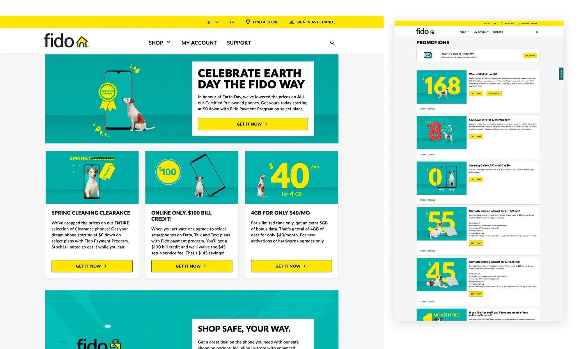
Fido was not visually pleasing, dynamic, or fitting with current web design standards.
Lacked dimension, gridded, and repetitive.
It didn’t speak to the customer base and lacked the energy seen in retail and social.
Inconsistencies were abundant.
A lot of the features looked out of place, as they were implemented as needed without a designer.
No defined visual hierarchy.
The tone of the brand and the tone of the contents didn’t match.
(Serious content vs. playful brand)
The brand's energy seen in retail and social was not apparent on digital.
Defining the Problems
Original digital experience
The redesign
The primary goal of this redesign is to create a more customer-centric and engaging digital experience for Fido users.
This was to be achieved by establishing a dynamic and lifestyle-focused aesthetic across all Fido platforms, improving accessibility by deconstructing banners to allow imagery and text to stand alone, and implementing a clear design motif strategy to enhance customer understanding of available offers and services.
Carefully design every element and deliver a clear, unified voice(Bridging the retail, social and digital experiences).
Get rid of the grid-locked pattern.
Building the base
As a proof of concept, I created three illustrations symbolizing the rebrand's foundational elements: business, lifestyle, and value-added services.
Fun UI, a new visual system,
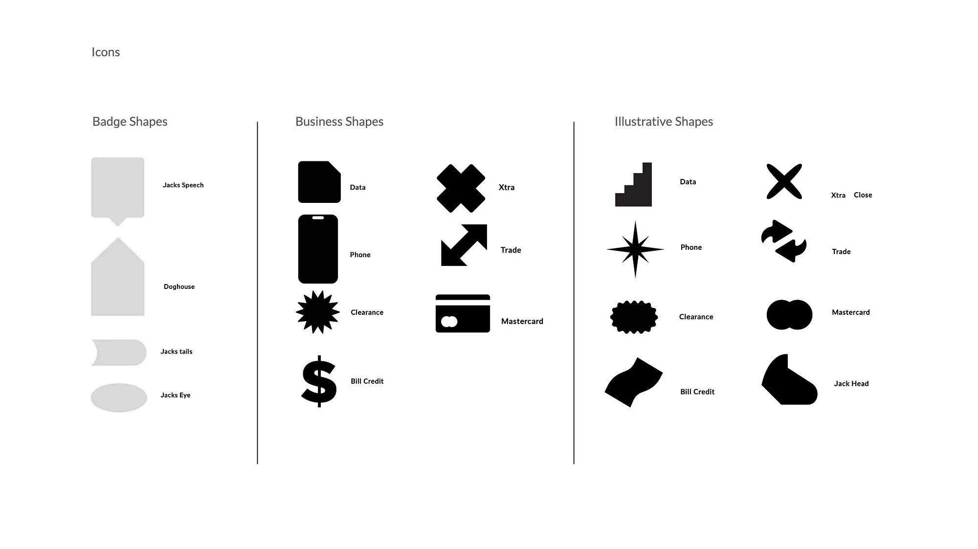
Recognizing our customers' web savviness and familiarity with UI elements, we reintroduced these elements with a playful twist. This included a refined iconography system and a complementary palette of new colours
Introducing the New Brand: A Phased Rollout Strategy
Phase 1: Introduction of animations to bring more dynamism to digital platforms.
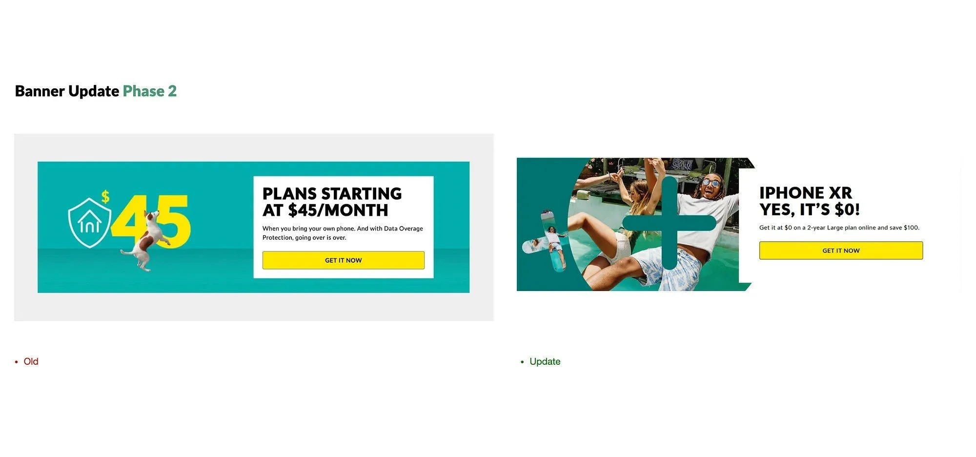
Phase 2: New banner that introduced new iconography and lifestyle imagery and removed baked-in text making the website more accessible. As part of this phase, the removal of the grey background helped to reduce the gridlock pattern.
Phase 3: Constructing and launching new components and enhancements.
Phase 1
I used animations as a way to incorporate an element of fun within the website while maintaining the reserved visual tone. I designed and prototyped interactive animations to make the website appear tangible and dynamic. This was a way to break away from the flat brick-and-mortar view of the website.
Phase 2
Addressing accessibility challenges was a key priority. By disentangling text from imagery, we ensured full compatibility with screen readers and removed the dependence on colour contrast for users with visual impairments. This stage of the project also saw the introduction of lifestyle imagery and a refreshed iconography system, adding dynamism and clarity to the digital experience.
Phase 3
I led the cross-functional effort to seamlessly integrate the new brand designs into our design system. This involved collaborating with UX, UI, and engineering teams to define component specifications, establish clear contribution guidelines, and ensure adherence to accessibility standards (AODA).
New component creation for the design system
Accessible, high-fidelity mockups, ready for development
Delivering the New Experience
I measured the impact of the visual brand system on the new Plans Page. When comparing the experience of the old plan vs. the new experience we saw a 50% reduction in bounce rate, from 32.85% to 15%.
This was a higher engagement it also helped customers get to the cart. Additionally, Bring Your Own Device, intent to buy, increased by 16%, and New Acquisition Customer intent to buy increased by 6%. This proves that the changes to the layout of the website had a further impact throughout the entire user experience.
The old Plans Page acted as a listing page and NAC users were stuck in a loop of finding affecting the business as customers weren’t able to access options.
The new Plans Page provided a display of all Plan options providing more direct access to the customer having a positive impact on the business.
Tracking revealed a 17% reduction in bounce rate on the redesigned plans page. Resulting in a measurable increase in NAC and BYO
Google Analytics revealed the new Plans Page, there was an increase in search keywords. The new page generated traffic at double the rate of the old page(150k clicks in 3 months vs 300k clicks in 12 months).
Next Steps
The new visual branding aims to revolutionize user experience by merging all customer journey phases into a cohesive and engaging digital space. Visuals are strategically used to humanize the brand, simplify complex information, and enhance navigation, ensuring accessibility for all users.
Using Fun UI iconography to build illustrations
Future state eCommerce experience
Mobile experience
Reflections
A/B testing would have been crucial for optimizing the phone plans page through data-driven iterations, testing elements like copy and pricing to maximize conversion. Equally important, comprehensive internal training would have ensured all teams—sales, support, marketing, and technical—were fully prepared. This combination of iterative testing and thorough training would have driven further conversions and increased the success of the plans page launch and facilitated ongoing improvement.
Conclusion
In conclusion, this redesign of Fido's Plans Page yielded a significant 50% increase in click-through rates, directly streamlining the user journey to the cart and demonstrating a clear improvement in usability. Coupled with positive internal feedback, this outcome validates the project's success in revitalizing Fido's digital presence. This project not only met its objective of enhancing user experience but also laid a strong foundation for future design phases, solidifying Fido's position as a competitive player in the Canadian telecommunications landscape.


